JAPANESE CANDLESTICK PATTERN
Before we jump in, it is worth spending time to understand in brief the history of the Japanese Candlesticks. As the name suggests, the candlesticks originated from Japan. The earliest use of candlesticks dates back to the 18th century by a Japanese rice merchant named Homma Munehisa.

Though the candlesticks have been in existence for a long time in Japan, and are probably the oldest form of price analysis, the western world traders were clueless about it. It is believed that sometime around 1980’s a trader named Steve Nison accidentally discovered candlesticks, and he actually introduced the methodology to the rest of the world. He authored the first ever book on candlesticks titled “Japanese Candlestick Charting Techniques” which is still a favorite amongst many traders.
Most of the pattern in candlesticks still retains the Japanese names; thus giving an oriental feel to technical analysis.
Candlestick Anatomy
While in a bar chart the open and the close prices are shown by a tick on the left and the right sides of the bar respectively, however in a candlestick the open and close prices are displayed by a rectangular body.
In a candlestick chart, candles can be classified as a bullish or bearish candle usually represented by blue/green/white and red/black candles respectively. Needless to say, the colors can be customized to any color of your choice; the technical analysis software allows you to do this. In this module, we have opted for the blue and red combination to represent bullish and bearish candles respectively.
Let us look at the bullish candle. The candlestick, like a bar chart, is made of 3 components.
1. The Central real body – The real body, rectangular in shape connects the opening and closing price
2. Upper shadow – Connects the high point to the close
3. Lower Shadow – Connects the low point to the open Have a look at the image below to understand how a bullish candlestick is formed:

Likewise, the bearish candle also has 3 components:
1. The Central real body – The real body, rectangular in shape which connects the opening and closing price. However, the opening is at the top end and the closing is at the bottom end of the rectangle
2. Upper shadow – Connects the high point to the open
3. Lower Shadow – Connects the Low point to the close
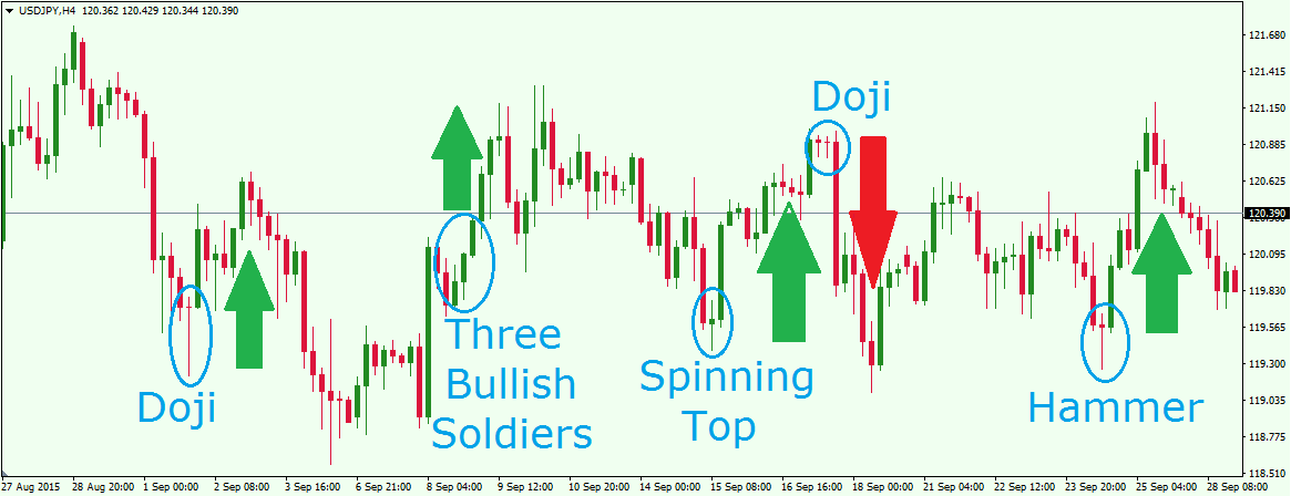
This is how the candlestick chart looks like if you were to plot them on a time series. The blue candle indicates bullishness and red indicates bearishness.


Comments
Post a Comment