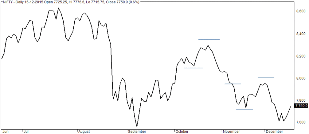
THE LINE CHART PATTERN
The line chart-
The line chart is the most basic chart type and it uses only one data point to form the chart . When it comes to technical analysis, a line chart is formed by plotting the closing prices of a stock or an index. A dot is placed for each closing price and the various dots are then connected by a line.
If we looking this 6 months data in the line chart is formed by connecting the dots of the closing price 6 months.

The line charts can be plotted for various time frames namely monthly, weekly,
hourly etc. So ,if you wish to draw a weekly line chart, you can use weekly closing
prices of securities and likewise for the other time frames as well.
The advantage of the line chart is its simplicity. With one glance, the trader can
identify the generic trend of the security. However the disadvantage of the line chart
is also its simplicity. Besides giving the analysts a view on the trend, the line chart
does not provide any additional detail. Plus the line chart takes into consideration
only the closing prices ignoring the open, high and low. For this reason traders
prefer not to use the line charts.

Comments
Post a Comment